Creating vibrant and nuanced colors is a cornerstone of art and design. While you might readily reach for a tube of orange paint, understanding how to mix orange yourself unlocks a world of color possibilities. You may know the basic formula: red and yellow make orange. But what kind of orange are you aiming for? A bright, sunny citrus? A deep, earthy rust? Or a soft, muted apricot? The secret lies in understanding color mixing and exploring different proportions and additions.
This guide will delve into the art of mixing orange, covering everything from the fundamental principles to creating a spectrum of orange shades, perfect for artists, crafters, and anyone curious about color theory. Whether you are working with acrylics, watercolors, dyes, or markers, mastering orange mixing will expand your creative palette and give you greater control over your artistic expression.
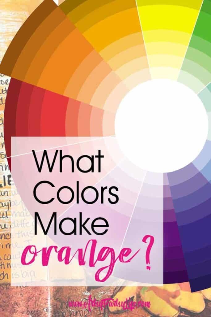
Understanding Tints, Shades, and Tones of Orange
Before we dive into specific orange recipes, let’s clarify some essential color terminology: tints, shades, and tones. These terms describe variations of a base color, achieved by adding white, black, or gray.
Tints are created by adding white to a color. This lightens the color and makes it paler. For orange, adding white will produce softer, pastel oranges, moving towards peach or creamsicle hues.
Shades are created by adding black to a color. This darkens the color, making it richer and deeper. Adding black to orange will lead to darker oranges like bronze, rust, or burnt orange.
Tones are created by adding gray (or both black and white) to a color. While sometimes used, adding gray to orange can often result in a muddy or less vibrant color. It’s generally recommended to achieve muted oranges through careful mixing of complementary or analogous colors instead of directly adding gray.
Experimenting with tints and shades of orange is a fantastic way to add depth and dimension to your artwork. A touch of white can create highlights, while a hint of black can define shadows and contours.
How to Mix Orange: Exploring Different Orange Colors
Orange is a secondary color, meaning it’s created by mixing two primary colors. In the case of orange, those primary colors are red and yellow. Mixing equal parts of red and yellow will generally give you a “true” or standard orange. However, by adjusting the proportions of red and yellow, and by adding other colors in small amounts, you can create a wide range of orange variations.
To provide a practical guide, let’s explore how to mix different shades of orange, inspired by common color names and visual references. For each shade, we’ll break down the color mixing process in a simple, understandable way, moving beyond complex color codes and into intuitive mixing instructions.
Mixing True Orange Color
To achieve a classic, bright orange:
- Mix equal parts red and yellow. Start with a 1:1 ratio of red to yellow paint.
- Adjust as needed. If the orange is too red, add a little more yellow. If it’s too yellow, add a touch more red.
- Consider your reds and yellows. Different shades of red and yellow will influence the final orange. For a vibrant orange, use a warm red (leaning towards yellow) and a warm yellow. Cooler reds or yellows (leaning towards blue) might produce a slightly duller orange.
Mixing Bronze Color
For a rich, metallic bronze orange:
- Start with yellow as the base. Use approximately half yellow as your starting point.
- Add more red than blue. Incorporate red gradually, using more red than you would blue in the next step.
- Introduce a tiny bit of blue and black. Add a very small amount of blue to deepen the color and then a touch of black to create that characteristic bronze darkness and earthiness. Be very cautious with black, adding just a speck at a time.
- Mix thoroughly. Ensure all colors are blended completely for a smooth bronze hue.
Mixing Rust Color
To create an earthy, oxidized rust orange:
- Equal parts red and yellow as a base. Begin with roughly equal amounts of red and yellow paint.
- Add a little blue and black. Introduce a small amount of blue to tone down the brightness and create depth. Then, add a tiny touch of black to further darken and “age” the orange, creating that rusty effect. Again, use black sparingly.
- Adjust for desired rustiness. You can adjust the proportions of blue and black to control the depth and earthiness of the rust color.
Mixing Apricot Color
For a soft, pale apricot orange:
- Start with mostly yellow. Use approximately two-thirds yellow as your base.
- Add about one-third red. Gradually mix in red until you achieve a light orange base.
- Introduce a tiny bit of blue and white. Add a minuscule amount of blue to soften the orange and prevent it from being too bright. Then, add white gradually to lighten the color to a pale, delicate apricot shade. The white is crucial for achieving the pastel quality of apricot.
Mixing Goldenrod Color
To create a muted, golden yellow-orange like goldenrod:
- Predominantly yellow. Start with a base of mostly yellow paint.
- Add a bit of red. Introduce red gradually, using a smaller amount than yellow.
- Introduce a smaller amount of blue and a pinch of black. Add a smaller amount of blue compared to red, and then a very small pinch of black to create a shade and give it that characteristic muted, goldenrod tone.
- Adjust for golden hue. You might need to fine-tune the amounts of red, blue, and black to achieve the specific goldenrod shade you desire.
Mixing Honey Color
For a warm, inviting honey orange:
- Two-thirds yellow as a base. Start with approximately two-thirds yellow paint.
- One-third red. Mix in about one-third red paint to create a warm orange base.
- Tiny bit of blue. Add just a very small touch of blue to slightly deepen and enrich the color, giving it that characteristic honey warmth without making it muddy.
Mixing Firebrick Color
To create a deep, robust firebrick orange:
- Equal parts red and yellow. Start with roughly equal amounts of red and yellow paint.
- Add a little blue and a tiny bit of black. Introduce a small amount of blue to deepen the red-orange base. Then, add a very tiny amount of black to darken it further and create the firebrick’s characteristic depth and slight brownish undertone.
Mixing Salmon Color
For a light, pinkish-orange salmon color:
- More red than yellow. Use slightly more red than yellow as your base – a little over half red and a little less than half yellow.
- Add white to lighten and soften. Gradually add white paint to lighten the orange and create the soft, pastel, pinkish tone characteristic of salmon. White is key to achieving the lightness and pink undertones of salmon.
Exploring Color Theory: Complementary Colors for Orange
Understanding complementary colors can greatly enhance your use of orange in art and design. Complementary colors are those that sit directly opposite each other on the color wheel. For orange, the complementary color is blue.
Orange and blue create a visually striking and dynamic contrast when used together. This combination is often seen in nature and is effective in art for creating vibrancy and drawing attention. Different shades of blue, such as light blue or navy, will offer varied effects when paired with orange shades. For instance, a bright orange next to a deep navy blue will create a bold contrast, while a pastel apricot orange with a soft sky blue will offer a gentler, more harmonious feel.
Beyond true blue, consider the complements to different orange shades. For example, teal can be a beautiful complement to salmon, while periwinkle might pair wonderfully with goldenrod, creating more nuanced and sophisticated color palettes.
Can Orange and Purple Work Together?
While not complementary, orange and purple are analogous colors, meaning they are located near each other on the color wheel (with red in between). Analogous color schemes can create harmony and unity, but orange and purple can be a trickier combination than some others.
Because they are relatively far apart on the color wheel, orange and purple can sometimes clash or compete for attention if not handled carefully. However, when used thoughtfully, they can create striking and dramatic effects, particularly in bold, modern designs or in artwork seeking a sense of vibrant energy. The key is often to vary the shades and intensities of both colors. For example, a muted, dusty purple might pair more harmoniously with a vibrant orange, or vice versa.
Step-by-Step Guide to Mixing Your Own Orange Hues
Ready to put your color mixing knowledge into practice? Here’s a simple guide to get you started:
Materials You’ll Need:
- Paints of your choice: Acrylics, watercolors, or oils all work well.
- Paintbrushes: For mixing and application.
- Palette or mixing surface: A palette, plate, or even wax paper will do.
- Containers for water (if using watercolors or acrylics).
Instructions for Mixing Various Orange Shades:
- True Orange: Mix equal parts red and yellow.
- Bronze: Mix half yellow, then add more red than blue, and a tiny bit of black.
- Rust: Mix half yellow and half red, then add a little bit of blue and a tiny bit of black.
- Apricot: Mix two-thirds yellow, one-third red, and a very tiny bit of blue, then lighten with white to achieve the desired pastel shade.
- Goldenrod: Mix mostly yellow, a bit of red, about half of the red amount in blue, and a pinch of black.
- Honey: Mix two-thirds yellow, one-third red, and a tiny bit of blue.
- Firebrick: Mix half yellow, half red, a little blue, and a tiny bit of black.
- Salmon: Mix a little more than half red and a little less than half yellow, then lighten with white to get the pale pinkish-orange tone.
Important Notes:
- Start with small amounts: It’s easier to add more paint than to take it away. Begin with small dabs of color and mix gradually.
- Mix thoroughly: Ensure your colors are completely blended for smooth, even hues.
- Adjust as needed: Color mixing is an art, not a science. Don’t be afraid to experiment and adjust proportions until you achieve the exact shade you’re looking for.
- Embrace experimentation: There are no strict rules in art. Feel free to deviate from these guidelines and discover your own unique orange variations!
What Colors Make Orange: Wrap-Up
Mixing your own orange colors is a rewarding and empowering skill for any artist or creative individual. It opens up a world of subtle variations and personalized hues that you can’t achieve with pre-mixed paints alone. By understanding the basics of color mixing and experimenting with different proportions and additions, you can confidently create a spectrum of orange shades, from bright and sunny to deep and earthy.
So, grab your paints, embrace the process, and start mixing your perfect oranges today!