It’s a fundamental art lesson we learn early on: blue and yellow make green. But the world of green is far more diverse than that simple equation suggests. Are you aiming for a vibrant lime green, a muted sage, or a deep forest green? Understanding the nuances of color mixing opens up a spectrum of verdant possibilities. Let’s explore how to truly master making green and all its beautiful variations.
Further Exploration: Dive deeper into color mixing with guides on How To Make Purple and How To Make Orange.
As a creator, especially when working on projects like junk journal pages, the need for custom colors arises frequently. Sometimes, you might not have the exact shade of green acrylic paint you envision. This exploration began when I needed a lively lime green backdrop to beautifully contrast with pink floral elements in one of my journal pages.
The beauty of green lies in its versatility. From the bright zest of lime to the deep richness of forest green, each shade contributes a unique background element. The magic truly happens when you pair green with complementary colors, like the striking contrast of pink and magenta that makes them pop on the page.
This guide is designed to be your go-to reference for mixing a wide array of green shades. We’ll break down the simple steps to create the exact green you need, whether you’re working with paints, dyes, or markers.
Understanding Tints, Shades, and Tones of Green
Before we delve into specific green recipes, it’s crucial to grasp the concepts of tints and shades. These are fundamental to modifying any color, including green, to achieve lighter or darker variations.
Tints are created by lightening a color by adding white. For green, adding white will produce lighter, pastel greens, approaching sage green but often lacking its characteristic depth.
Shades are achieved by darkening a color with black. Introducing black to green will lead you towards deeper, richer greens, culminating in shades close to a true forest green.
Tones, less commonly used in pure color mixing, are made by adding grey (a mixture of black and white). While tones can create muted versions of green, they can sometimes result in a “muddier” appearance, which might not always be desirable, especially when aiming for vibrant greens.
Experimenting with black and white is invaluable, especially when you’re working on techniques like shading and highlighting in your artwork. These additions can dramatically alter the mood and depth of your green creations.
Mixing Different Shades of Green: Recipes and Ratios
Color theory can sometimes feel abstract. When it comes to practical application, especially when you’re in the midst of creating, having quick, easy-to-follow recipes for shades like lime green or chartreuse is incredibly helpful. Finding straightforward instructions for mixing green shades wasn’t always easy, which is why this guide aims to provide clear, “plain English” descriptions for achieving various greens.
The recipes provided below are derived from analyzing color codes – specifically, Hex codes (used in computers), CMYK (Cyan, Magenta, Yellow, Black), and RGB (Red, Green, Blue) values. By translating these numerical representations into relatable color mixing instructions, we bridge the gap between color theory and practical application.
For those interested in the precise hexadecimal representations of green shades, resources like this comprehensive guide offer detailed information.
Let’s dive into the recipes for creating a spectrum of greens:
How to Make True Green
Perfect Green (True Green): Hex #008000
- RGB: 0% Red, 153% Green, 0% Blue
- CMYK: C 85% M 12% Y 100% K 2%
- Mixing Guide: For a true, balanced green, use half yellow and half blue. This classic combination creates the foundational green we all recognize.
How to Make Dark Forest Green
Dark Forest Green: Hex #0b6623
- RGB: 0% Red, 102% Green, 51% Blue
- CMYK: C 91% M 34% Y 100% K 27%
- Mixing Guide: To achieve the depth of forest green, start with half yellow and half blue (to create your base green), then add a touch of red and a bit of black. The red deepens the green while the black darkens it further, mimicking the shadowy hues of a forest.
How to Make Olive Green
Olive Green: Hex #708238
- RGB: 112% Red, 130% Green, 56% Blue
- CMYK: C 59% M 32% Y 100% K 13%
- Mixing Guide: For a muted, earthy olive green, combine half yellow, one-quarter blue, a bit of red, and just a tiny touch of black. The reduced blue and addition of red and black give olive green its characteristic muted and warm undertones.
How to Make Sage Green
Sage Green: Hex #9dc183
- RGB: 157% Red, 193% Green, 131% Blue
- CMYK: C 42% M 7% Y 63% K 00%
- Mixing Guide: To create the soft, muted tone of sage green, use two-thirds yellow, one-third blue, and a very small amount of red. The higher proportion of yellow lightens the green base, while the red softens and grays it slightly, achieving that dusty sage effect.
How to Make Chartreuse
Chartreuse (Bright Green): Hex #7fff00
- RGB: 127% Red, 255% Green, 00% Blue
- CMYK: C 49% M 0% Y 100% K 0%
- Mixing Guide: For a vibrant, electric chartreuse, mix one-third blue with two-thirds yellow. The increased yellow content results in a bright, almost neon green that is characteristic of chartreuse.
How to Make Lime Green
Lime Green: Hex #c7ea46
- RGB: 199% Red, 234% Green, 70% Blue
- CMYK: C 27% M 0% Y 92% K 0%
- Mixing Guide: To mix a zesty lime green, use three-quarters yellow and one-quarter blue. The dominance of yellow creates the bright, citrusy quality of lime green.
How to Make Teal
Teal: Hex #008080
- RGB: 0% Red, 128% Green, 128% Blue
- CMYK: C 87% M 31% Y 49% K 8%
- Mixing Guide: For the sophisticated blue-green of teal, start with half blue, then add a little more than one-quarter yellow, a little less than one-quarter red, and a touch of black. Teal leans towards blue, so blue is the dominant base, with yellow and red to add depth and black to slightly mute and enrich the shade.
How to Make Turquoise
Turquoise: Hex #3fe0d0
- RGB: 63% Red, 224% Green, 208% Blue
- CMYK: C 58% M 0% Y 29% K 0%
- Mixing Guide: To create the vibrant, semi-transparent blue-green of turquoise, mix two-thirds blue and one-third yellow. Turquoise is heavily blue-based but with enough yellow to push it firmly into the blue-green spectrum.
How to Make Blue Green
Blue Green: Hex #0d98ba
- RGB: 13% Red, 152% Green, 186% Blue
- CMYK: C 80% M 25% Y 17% K 0%
- Mixing Guide: For a blue-green that emphasizes the blue, use more than half blue (approximately 65%), and then mix in the rest with a combination of red and yellow. The higher blue ratio ensures it stays firmly in the blue-green family, with red and yellow adding complexity rather than shifting it towards a true green.
How to Make Aqua
Aqua: Hex #00FFFF
- RGB: 0% Red, 255% Green, 255% Blue
- CMYK: C 53% M 0% Y 12% K 0%
- Mixing Guide: To achieve the light, watery blue-green of aqua, combine four-fifths blue and one-fifth yellow. Aqua is very blue-dominant, with just a hint of yellow to give it a slight green undertone, making it a very pale and bright blue-green.
Are These Colors Really Green? Exploring the Green Spectrum
In art, particularly when inspired by nature, the definition of “green” expands beyond the textbook true green. Observing nature reveals a spectrum of greens, many subtly shifting towards blue or yellow.
Consider a blade of grass underwater; it might appear more teal than a typical green. Similarly, the veins of a leaf often exhibit a lime green hue, distinct from the leaf’s overall color. Yet, in natural settings, these varied greens harmonize beautifully.
As an artist, it’s liberating to move beyond rigid color rules. Instead of fixating on the “perfect” green, focus on selecting colors that intuitively harmonize in your artwork. Trust your artistic sense to guide you in choosing greens that create the desired effect, whether it’s a vibrant landscape or a subtle, muted piece.
Green Color Mixing FAQs
Exploring color mixing often brings up common questions. Here are some frequently asked questions about mixing green:
What is the Complementary Color for Green?
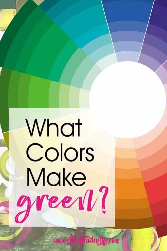
The color wheel is an invaluable tool for understanding color relationships. It visually represents complementary colors – those that sit directly opposite each other and create the most striking contrast.
As you can see from the color wheel, red is directly opposite green, making it green’s complementary color. This relationship extends to tints and shades; therefore, pinks and crimsons also serve as complements to various greens.
However, the concept of complementary colors becomes nuanced with shades like olive green or camo green, which fall outside the “true green” range. For instance, lime green might pair more vibrantly with magenta than with navy blue, even though red is theoretically its complement.
Complementary colors, when used together, enhance each other, making them excellent choices for creating visual interest and dynamic compositions in your artwork. Currently, combinations like lime green and magenta or red and turquoise are particularly trendy and visually appealing.
Isn’t Green Just Yellow and Blue?
Yes, in its most basic form, true green is indeed a mixture of yellow and blue. However, the colors we often categorize as “green,” especially analogous colors (those adjacent on the color wheel), often incorporate red in addition to blue and yellow, just with a greater emphasis on yellow and blue ratios. This slight inclusion of red contributes to the depth and complexity of many green shades.
How Can I Get The “Right” Green Color For My Artwork?
The best approach to achieving your desired green is to start with the foundational mix of yellow and blue. From there, adjust the shade by adding white to lighten it (creating tints), or black to darken it (creating shades). If you need to adjust the tone, consider adding a tiny amount of red to move it towards olive or sage tones.
With practice, color mixing becomes more intuitive. Experimentation is key, and with each attempt, you’ll develop a better feel for how different colors interact and how to achieve your desired shade.
Do Green and Orange Go Together?
Green, orange, and purple are positioned at almost equidistant points on the color wheel, forming a triadic color scheme. While these colors can be used together, they don’t inherently create harmony like complementary or analogous colors. Using green, orange, and purple as primary colors in the same piece can create visual tension and is best approached intentionally, perhaps to evoke a specific mood or effect, rather than for general aesthetic appeal.
Active Time: 5 minutes
Total Time: 5 minutes
Difficulty: Easy
Estimated Cost: $10
Materials You’ll Need
- Any type of paint (acrylic, watercolor, oil), dyes, or markers
- Paintbrush or mixing tool for paints
- Containers for mixing paints
Instructions: Green Color Recipes at a Glance
- Green: Half yellow and half blue
- Dark forest green: 1/2 yellow, 1/2 blue, some red, and a bit of black
- Olive green: Half yellow, 1/4 blue, some red, and a tiny bit of black
- Sage: 2/3 yellow, 1/3 blue, and a very small amount of red
- Chartreuse: 1/3 blue and 2/3 yellow
- Lime Green: 3/4 yellow, 1/4 blue
- Teal: Half blue, a little more than 1/4 yellow, a little less than 1/4 red, and a bit of black
- Turquoise: 2/3 blue and 1/3 yellow
- Blue green: More than half blue (approx. 65%), the rest a mix of red and yellow
- Aqua: 4/5 blue and 1/5 yellow
Notes on Mixing Greens
The beauty of color mixing lies in its freedom. Don’t be constrained by rigid rules. Experiment, explore, and mix yellow and blue to your heart’s content. Discover the myriad shades of green that resonate with you and enhance your creative projects.
What Colors Make Green: In Conclusion
As someone whose favorite color is green (lime green, in fact, inspired my business logo!), I can attest to the vast and versatile world of greens.
Knowing that blue and yellow make green is just the starting point. There’s an entire universe of tints, shades, and tones of green to explore, each offering unique possibilities in art and design. Embrace the spectrum, experiment with different mixes, and unleash the power of green in your creations. Let your exploration of green colors inspire your next masterpiece!