What Is A Bar Graph? It’s a question many people ask, from students tackling math assignments to professionals analyzing market trends. A bar graph, also known as a bar chart, visually represents data using rectangular bars of varying heights or lengths. These bars correspond to different categories, making it easy to compare and contrast data points. At WHAT.EDU.VN, we aim to simplify complex concepts, and understanding bar graphs is a fundamental skill for data interpretation. Whether you’re a student, a data enthusiast, or someone just looking to improve their analytical skills, mastering bar graphs is a valuable asset. Learn about data visualization, statistical charts, and comparative graphs.
1. What is a Bar Graph and Why is it Important?
A bar graph is a visual tool that represents data using rectangular bars. The length or height of each bar is proportional to the value it represents. Bar graphs are used to compare different categories of data, making it easy to identify trends, patterns, and outliers. They are widely used in various fields, including education, business, science, and journalism, to present information in a clear and concise manner.
Understanding the Significance
Why are bar graphs so important? Here’s why:
- Clarity: They present complex data in a simple, easy-to-understand format.
- Comparison: They allow for quick and straightforward comparisons between different categories.
- Insight: They help in identifying trends and patterns that might not be obvious in raw data.
- Communication: They facilitate effective communication of data to a wide audience.
Consider this scenario: Imagine you want to present the sales figures for different products in a store. Instead of listing the numbers in a table, a bar graph can visually represent each product’s sales, making it easy to see which products are performing best.
2. Key Elements of a Bar Graph
To fully grasp “what is a bar graph,” it’s crucial to understand its core components. A typical bar graph consists of the following elements:
- Axes:
- X-axis (Horizontal Axis): Usually represents the categories being compared (e.g., product names, months, countries).
- Y-axis (Vertical Axis): Represents the numerical values corresponding to each category (e.g., sales figures, population, temperature).
- Bars: Rectangular shapes representing the data values for each category. The length or height of the bars is proportional to the value they represent.
- Title: A concise description of what the bar graph represents.
- Labels: Text that identifies the categories on the x-axis and the scale on the y-axis.
- Scale: The range of values displayed on the y-axis. The scale should be chosen appropriately to accurately represent the data.
Example
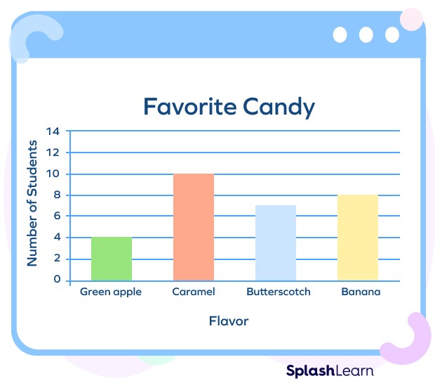
Let’s say we want to create a bar graph showing the number of students enrolled in different subjects.
- X-axis: Subjects (Math, Science, English, History)
- Y-axis: Number of Students
- Bars: Each subject will have a bar, with the height corresponding to the number of students enrolled.
- Title: “Student Enrollment by Subject”
- Labels: Subject names on the x-axis, and number of students on the y-axis.
- Scale: The y-axis scale could range from 0 to the highest enrollment number, say 100.
3. Types of Bar Graphs
Now that we’ve answered “what is a bar graph” and explored its elements, let’s delve into the different types of bar graphs:
- Vertical Bar Graph (Column Chart): Bars are oriented vertically, with the categories on the x-axis and the values on the y-axis. This is the most common type of bar graph.
- Horizontal Bar Graph: Bars are oriented horizontally, with the categories on the y-axis and the values on the x-axis. Horizontal bar graphs are useful when the category names are long or when there are many categories.
- Grouped Bar Graph (Clustered Bar Graph): Multiple bars are grouped together for each category, representing different subgroups or variables. This type of graph is used to compare multiple aspects of each category.
- Stacked Bar Graph: Bars are stacked on top of each other for each category, representing different subgroups that add up to a total value. This type of graph is used to show the composition of each category.
3.1. Vertical Bar Graph (Column Chart)
Also known as a column chart, this is the most familiar type of bar graph. The categories are displayed along the horizontal axis (x-axis), and the numerical values are displayed along the vertical axis (y-axis). The height of each bar represents the magnitude of the value for that category. Vertical bar graphs are ideal for comparing the quantity of different items or changes over a period.
Example:
Imagine you want to compare the sales of different products in a store over a month. You could create a vertical bar graph with each product on the x-axis and the sales revenue on the y-axis.
3.2. Horizontal Bar Graph
In a horizontal bar graph, the orientation is flipped. The categories are displayed along the vertical axis (y-axis), and the numerical values are displayed along the horizontal axis (x-axis). The length of each bar represents the magnitude of the value for that category. Horizontal bar graphs are particularly useful when the category labels are long, as they provide more space for the labels to be displayed without overlapping.
Example:
Consider displaying survey results where respondents rated different aspects of a service. The aspects could be listed on the y-axis, and the average rating on the x-axis.
3.3. Grouped Bar Graph (Clustered Bar Graph)
A grouped bar graph, also known as a clustered bar graph, is used to compare multiple categories across different groups. For each category, there are multiple bars, each representing a different group. This allows for easy comparison between groups within each category and between categories.
Example:
Let’s say you want to compare the performance of students in different classes across various subjects. Each subject would be a category, and each class would be a group, with a separate bar for each class within each subject.
3.4. Stacked Bar Graph
In a stacked bar graph, each bar represents the total value, and different segments within the bar represent the contribution of different categories to that total. Stacked bar graphs are useful for showing how a total is divided into different parts and for comparing the composition of different totals.
Example:
Imagine you want to display the total sales of a company each year, with segments representing sales from different product lines. Each bar would represent a year, and the segments within the bar would represent the sales from each product line.
4. How to Create a Bar Graph: A Step-by-Step Guide
Now that we’ve covered “what is a bar graph” and its types, let’s look at how to create one:
Step 1: Collect and Organize Your Data
The first step in creating a bar graph is to gather the data you want to represent. Organize the data into categories and their corresponding values.
Step 2: Choose the Type of Bar Graph
Decide which type of bar graph best suits your data and the message you want to convey. Consider the number of categories, the need to compare subgroups, and the importance of showing composition.
Step 3: Draw the Axes
Draw the x-axis and y-axis. Label them appropriately, indicating the categories and values they represent.
Step 4: Determine the Scale
Choose a scale for the y-axis that accurately represents the range of values in your data. Ensure that the scale is consistent and easy to read.
Step 5: Draw the Bars
Draw the bars for each category, ensuring that the length or height of each bar is proportional to the value it represents. Use consistent width for the bars and consistent spacing between them.
Step 6: Add Labels and Title
Add labels to the x-axis and y-axis, clearly indicating the categories and values. Give your bar graph a descriptive title that summarizes the information it presents.
Step 7: Review and Refine
Review your bar graph to ensure that it is accurate, clear, and easy to understand. Make any necessary refinements to improve its visual appeal and effectiveness.
5. Practical Applications of Bar Graphs
Bar graphs are versatile tools used across various fields. Here are some common applications:
- Business: Comparing sales figures, market share, customer satisfaction ratings, and revenue by product line.
- Education: Presenting student performance data, comparing test scores, and showing enrollment statistics.
- Science: Displaying experimental results, comparing data sets, and illustrating trends in scientific research.
- Sports: Comparing team statistics, player performance, and game scores.
- Politics: Showing election results, polling data, and demographic information.
Examples in Different Fields
- Marketing: A bar graph showing the effectiveness of different advertising campaigns.
- Healthcare: A bar graph comparing patient recovery rates for different treatments.
- Finance: A bar graph illustrating the performance of different investment portfolios.
- Environmental Science: A bar graph showing changes in air quality over time.
6. Advantages and Disadvantages of Using Bar Graphs
Like any data visualization tool, bar graphs have their strengths and weaknesses. Understanding these can help you decide when to use them and when to consider other options.
Advantages
- Easy to Understand: Bar graphs are simple and intuitive, making them accessible to a wide audience.
- Effective Comparison: They allow for quick and easy comparison of data between different categories.
- Visual Impact: They present data in a visually appealing format, capturing attention and facilitating understanding.
- Versatility: They can be used to represent a wide range of data types and can be adapted to different situations.
Disadvantages
- Limited Data: Bar graphs are best suited for representing a relatively small number of categories.
- Lack of Detail: They may not provide as much detail as other types of graphs, such as scatter plots or line graphs.
- Potential for Misinterpretation: If not designed carefully, bar graphs can be misleading or misinterpreted.
- Oversimplification: Complex data may be oversimplified, leading to a loss of important information.
7. Common Mistakes to Avoid When Creating Bar Graphs
To ensure your bar graphs are effective and accurate, avoid these common mistakes:
- Inconsistent Scale: Using an inconsistent scale on the y-axis can distort the data and lead to misinterpretations.
- Missing Labels: Failing to label the axes and bars can make the graph difficult to understand.
- Cluttered Design: Overcrowding the graph with too many categories or unnecessary elements can reduce its clarity.
- Misleading Colors: Using colors that are distracting or that convey unintended meanings can confuse the audience.
- Ignoring Context: Presenting data without providing sufficient context can lead to misunderstandings.
8. Examples and Case Studies of Effective Bar Graphs
Let’s explore some examples of well-designed bar graphs and how they effectively communicate data.
Case Study 1: Comparing Product Sales
A retail company uses a vertical bar graph to compare the sales of different product categories over the past year. The x-axis represents the product categories (e.g., clothing, electronics, home goods), and the y-axis represents the total sales revenue. The graph clearly shows which product categories are performing best and which ones need improvement.
Case Study 2: Tracking Student Performance
A school district uses a grouped bar graph to track student performance in different subjects across different schools. Each subject has a group of bars, with each bar representing the average score for a particular school. This allows administrators to compare the performance of different schools and identify areas where additional support may be needed.
Case Study 3: Analyzing Customer Satisfaction
A service company uses a horizontal bar graph to analyze customer satisfaction ratings for different aspects of its service. The y-axis represents the different aspects (e.g., customer support, product quality, delivery speed), and the x-axis represents the average satisfaction rating. This allows the company to identify areas where it is excelling and areas where it needs to improve.
9. Advanced Techniques for Enhancing Bar Graphs
To make your bar graphs even more effective, consider these advanced techniques:
- Adding Error Bars: Error bars can be added to show the variability or uncertainty in the data.
- Using Color Strategically: Use color to highlight important data points or to distinguish between different subgroups.
- Incorporating Annotations: Add annotations to provide additional context or to draw attention to specific features of the data.
- Creating Interactive Bar Graphs: Use interactive elements to allow users to explore the data in more detail.
10. Resources for Learning More About Bar Graphs
If you’re eager to deepen your understanding of “what is a bar graph” and how to use them effectively, here are some valuable resources:
- Online Courses: Platforms like Coursera, edX, and Khan Academy offer courses on data visualization and statistics that cover bar graphs in detail.
- Books: “The Visual Display of Quantitative Information” by Edward Tufte and “Storytelling with Data” by Cole Nussbaumer Knaflic are excellent resources for learning about data visualization principles.
- Websites and Blogs: Websites like Chartio, FlowingData, and the Visualising Data blog offer articles, tutorials, and examples of effective bar graph design.
- Software Documentation: Familiarize yourself with the documentation for data visualization software like Excel, Tableau, and R to learn how to create and customize bar graphs.
11. Bar Graphs and Data Interpretation
The ultimate goal of creating a bar graph is to interpret the data effectively. Here are some key steps to follow:
- Understand the Context: Before diving into the graph, understand the context of the data. What is being measured? Who are the subjects? What is the time period?
- Read the Axes: Carefully read the labels on the x-axis and y-axis to understand what the graph is representing.
- Identify Trends: Look for trends and patterns in the data. Are there any categories that stand out? Are there any noticeable changes over time?
- Compare Categories: Compare the values for different categories to identify similarities and differences.
- Draw Conclusions: Based on your observations, draw conclusions about the data. What do the results mean? What are the implications?
12. The Future of Bar Graphs in Data Visualization
Bar graphs have been a staple of data visualization for decades, and they are likely to remain so in the future. However, as technology evolves and new data visualization techniques emerge, bar graphs are also evolving.
- Interactive Bar Graphs: Interactive bar graphs that allow users to drill down into the data and explore different aspects of it are becoming increasingly popular.
- Animated Bar Graphs: Animated bar graphs that show changes over time are a powerful way to communicate trends and patterns.
- Integration with Other Visualizations: Bar graphs are often integrated with other types of visualizations, such as maps and scatter plots, to provide a more comprehensive view of the data.
As data visualization continues to evolve, bar graphs will adapt and remain a valuable tool for communicating data effectively.
13. Bar Graphs and Statistical Analysis
Bar graphs are not only useful for visualizing data but also for performing statistical analysis. Here are some statistical measures that can be derived from bar graphs:
- Mean: The average value of the data.
- Median: The middle value of the data.
- Mode: The most frequent value of the data.
- Range: The difference between the highest and lowest values.
- Standard Deviation: A measure of the variability of the data.
By calculating these statistical measures, you can gain a deeper understanding of the data and draw more meaningful conclusions.
14. Bar Graphs vs. Other Types of Graphs
While bar graphs are versatile, they are not always the best choice for visualizing data. Here’s a comparison of bar graphs with other common types of graphs:
- Line Graphs: Line graphs are better for showing trends over time.
- Pie Charts: Pie charts are better for showing the proportion of different categories in a whole.
- Scatter Plots: Scatter plots are better for showing the relationship between two variables.
- Histograms: Histograms are better for showing the distribution of a single variable.
Choosing the right type of graph depends on the data you want to represent and the message you want to convey.
15. Frequently Asked Questions (FAQs) About Bar Graphs
To further clarify “what is a bar graph,” let’s address some frequently asked questions:
Q: What is the difference between a bar graph and a histogram?
A: A bar graph is used to compare different categories, while a histogram is used to show the distribution of a single variable.
Q: Can a bar graph have negative values?
A: Yes, a bar graph can have negative values. In this case, the bars extend below the x-axis.
Q: What is a good rule of thumb for the number of categories in a bar graph?
A: A good rule of thumb is to limit the number of categories to around 5-10. Too many categories can make the graph cluttered and difficult to read.
Q: Can I use a bar graph to compare two different datasets?
A: Yes, you can use a grouped bar graph or a stacked bar graph to compare two different datasets.
Q: What software can I use to create bar graphs?
A: You can use software like Excel, Google Sheets, Tableau, R, and Python to create bar graphs.
16. Exercises and Practice Problems
To solidify your understanding of “what is a bar graph,” try these exercises:
- Create a Bar Graph: Collect data on the number of cars of different colors in your neighborhood. Create a bar graph to represent the data.
- Interpret a Bar Graph: Find a bar graph in a newspaper or online. Analyze the graph and write a summary of the information it presents.
- Compare Bar Graphs: Find two bar graphs that represent similar data. Compare the graphs and discuss which one is more effective.
- Identify Mistakes: Find a bar graph that contains errors. Identify the errors and explain how to correct them.
- Design a Bar Graph: Design a bar graph to represent the results of a survey on people’s favorite hobbies.
17. Real-World Examples of Bar Graph Usage
Bar graphs are ubiquitous in the real world. Here are some examples of how they are used in different contexts:
- News Media: News organizations use bar graphs to present election results, economic data, and public opinion polls.
- Government Agencies: Government agencies use bar graphs to track demographic trends, crime rates, and environmental indicators.
- Nonprofit Organizations: Nonprofit organizations use bar graphs to show the impact of their programs and to raise awareness about social issues.
- Academic Research: Researchers use bar graphs to present the results of their studies and to compare different groups or conditions.
- Personal Finance: Individuals can use bar graphs to track their income and expenses, to compare different investment options, and to plan for retirement.
18. The Importance of Accessibility in Bar Graph Design
When creating bar graphs, it’s important to consider accessibility for people with disabilities. Here are some tips for making your bar graphs more accessible:
- Use Clear and Simple Language: Use clear and simple language in the labels and title of the graph.
- Provide Alternative Text: Provide alternative text for the graph that describes the information it presents.
- Use High Contrast Colors: Use high contrast colors to make the graph easier to see for people with visual impairments.
- Avoid Relying Solely on Color: Avoid relying solely on color to convey information, as people with color blindness may not be able to distinguish between different colors.
- Provide a Data Table: Provide a data table that contains the information presented in the graph, so that people who cannot see the graph can still access the data.
19. Ethical Considerations When Using Bar Graphs
Bar graphs can be powerful tools for communicating information, but they can also be used to mislead or deceive. Here are some ethical considerations to keep in mind when using bar graphs:
- Be Accurate: Ensure that the data you present in the bar graph is accurate and reliable.
- Be Honest: Avoid distorting the data or using misleading scales or labels.
- Be Transparent: Disclose any limitations or biases in the data.
- Be Fair: Avoid using bar graphs to promote a particular agenda or to manipulate public opinion.
- Be Responsible: Use bar graphs responsibly and ethically, and always consider the potential impact of your work.
20. Seeking Further Assistance with Bar Graphs
Still have questions about “what is a bar graph” or need help creating one? At WHAT.EDU.VN, we’re here to provide the answers and support you need. Our team of experts can offer personalized guidance and assistance with any data-related questions you may have.
- Visit WHAT.EDU.VN: Explore our website for more information, tutorials, and resources on bar graphs and other data visualization techniques.
- Contact Us: Reach out to us with your specific questions or requests. We’re here to help you succeed in your data endeavors.
Remember, mastering bar graphs is a valuable skill that can enhance your ability to interpret data, communicate effectively, and make informed decisions.
Do you have any questions about data visualization or need help understanding a specific graph? Don’t hesitate to ask your questions for free at WHAT.EDU.VN. Our team is dedicated to providing quick, accurate, and easy-to-understand answers. We’re located at 888 Question City Plaza, Seattle, WA 98101, United States. You can also reach us via WhatsApp at +1 (206) 555-7890 or visit our website at what.edu.vn. Let us help you make sense of the world, one question at a time.