What Is Contrast? Contrast, the arrangement of opposing elements and visual differences, is a fundamental principle in art and design. Need quick answers to your questions? WHAT.EDU.VN provides a platform for free answers and expert insights, covering visual arts, balance, and a wide range of topics.
1. Understanding Contrast in Art
Contrast in art refers to the arrangement of opposite elements within a composition. It’s a powerful tool artists use to create visual interest, highlight focal points, and evoke specific emotions. These contrasting elements can include:
- Light and Dark (Value)
- Colors (Hue)
- Textures
- Sizes
- Shapes
- Lines
The effective use of contrast can transform a static image into a dynamic and engaging work of art. Contrast is closely related to the variety, which prevents an artwork from becoming monotonous. By strategically employing contrasting elements, artists guide the viewer’s eye, creating a sense of rhythm and emphasizing key aspects of the artwork.
2. The Power of Light and Dark Contrast (Chiaroscuro)
One of the most dramatic forms of contrast is the interplay between light and dark, often referred to as chiaroscuro. This technique was mastered by Renaissance painters and used to:
- Model forms, creating a three-dimensional effect
- Differentiate between foreground and background
- Create depth and spatial relationships
- Evoke a sense of drama and mystery
The use of chiaroscuro can be seen in the works of masters like Caravaggio and Rembrandt, who used dramatic lighting to highlight specific figures and create a powerful narrative. The stark contrast between light and shadow can also be used to explore complex themes and emotions, adding layers of meaning to the artwork.
3. Contrast in Contemporary Art: Optical Illusions and Visual Tricks
Contemporary artists continue to explore the possibilities of contrast, often pushing the boundaries of perception. The Op art movement, for example, relies heavily on the use of black and white contrast and geometric patterns to create optical illusions. These illusions can create a sense of movement, vibration, or instability, challenging the viewer’s perception of reality.
Artists like M.C. Escher have masterfully used contrast to create impossible spaces and paradoxical situations. By playing with perspective and geometric shapes, they create works that are both visually stunning and intellectually stimulating. The use of complementary colors can also create a strong sense of contrast, adding vibrancy and energy to the artwork.
4. Color Contrast: Complementary Colors and Vibrating Effects
Color plays a vital role in creating contrast in art. Complementary colors, those located opposite each other on the color wheel (e.g., red and green, blue and orange, yellow and purple), create a strong visual contrast when placed next to each other. This contrast can be used to:
- Make colors appear more vibrant
- Create a sense of energy and excitement
- Define shapes and forms
- Create a focal point
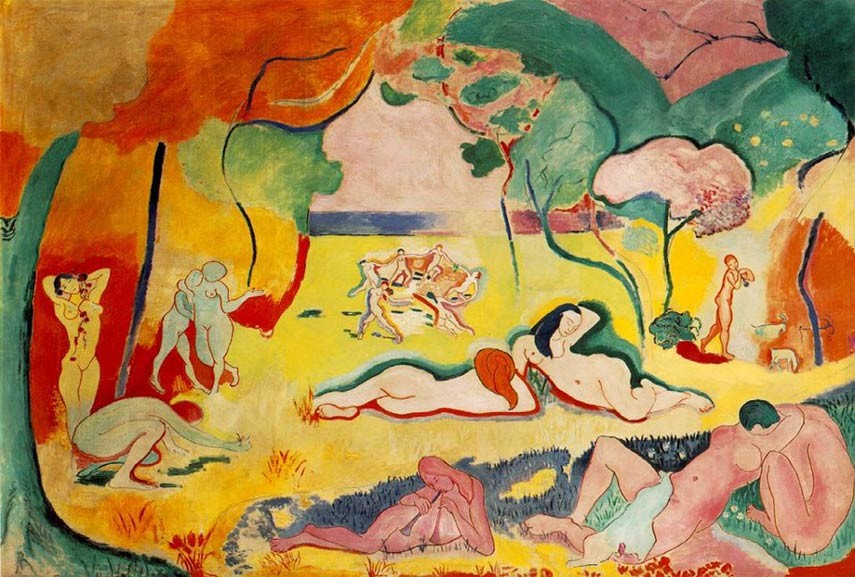
However, the use of complementary colors requires careful consideration. When not balanced properly, they can create a disturbing or unsettling effect, particularly when used on digital screens. Artists like Henri Matisse used bold color combinations to achieve a vibrant and expressive style.
5. Why Is Contrast Important? Exploring the Value of Opposites
Contrast is more than just a visual technique; it’s a fundamental tool for conveying meaning and creating impact. The value of contrast lies in its ability to:
- Define the focus and guide the viewer’s eye
- Suggest the idea of opposing forces or concepts
- Create a sense of depth and dimension
- Enhance the emotional impact of the artwork
- Help define the identity of the finished product
Without contrast, an artwork can appear flat, lifeless, and uninteresting. By strategically employing contrasting elements, artists can create works that are both visually appealing and conceptually rich. Contrast allows artists to explore complex themes and ideas, such as the duality of good and evil, the contrast between reality and illusion, or the tension between order and chaos.
6. Examples of Contrast in Art
To further illustrate the concept of contrast, let’s examine some specific examples from art history:
| Artwork | Artist | Type of Contrast | Description |
|---|---|---|---|
| The Night Watch | Rembrandt | Light and Dark (Chiaroscuro) | Rembrandt’s masterful use of light and shadow creates a dramatic and engaging scene. The strong contrast highlights the main figures and adds depth to the composition. |
| Starry Night | Vincent van Gogh | Color (Complementary) | Van Gogh’s use of blue and yellow hues creates a vibrant and dynamic atmosphere. The contrast between the warm and cool colors adds to the emotional intensity of the painting. |
| The Scream | Edvard Munch | Emotional (Anxiety vs. Serenity) | Munch’s iconic painting uses distorted shapes and jarring colors to convey a sense of anxiety and despair. The contrast between the figure’s tormented expression and the serene background creates a powerful emotional impact. |
| Composition with Red, Blue and Yellow | Piet Mondrian | Shape (Geometric vs. Organic) | Mondrian’s abstract compositions rely on the contrast between geometric shapes and primary colors to create a sense of balance and harmony. The simplicity of the design allows the viewer to focus on the relationships between the different elements. |
| Guernica | Pablo Picasso | Texture (Rough vs. Smooth), Form (Distorted vs. Realistic) | Picasso’s powerful anti-war statement uses distorted figures and a monochromatic palette to convey the chaos and suffering of the Spanish Civil War. The contrast between the fragmented forms and the overall composition creates a sense of disorientation and unease. |
7. How to Use Contrast Effectively in Your Own Art
If you’re an artist or designer looking to incorporate contrast into your work, consider the following tips:
- Identify Your Focal Point: Determine what you want to emphasize in your artwork and use contrast to draw the viewer’s eye to that area.
- Experiment with Different Types of Contrast: Explore the possibilities of light and dark, color, texture, size, and shape to create visual interest.
- Consider the Emotional Impact: Think about the emotions you want to evoke and use contrast to reinforce those feelings.
- Balance and Harmony: While contrast is important, it’s also essential to maintain a sense of balance and harmony in your composition.
- Practice and Experiment: The best way to master the use of contrast is to practice and experiment with different techniques and approaches.
8. Contrast in Everyday Life: Beyond the Canvas
Contrast isn’t just limited to the world of art and design. It’s a fundamental principle that can be found in many aspects of our daily lives. Examples include:
- Fashion: Combining different colors, textures, and styles to create a unique and eye-catching look.
- Photography: Using light and shadow to create dramatic and evocative images.
- Music: Contrasting loud and soft passages, fast and slow tempos, and major and minor keys to create a dynamic and engaging musical experience.
- Literature: Using contrasting characters, settings, and themes to explore complex ideas and emotions.
- Cooking: Combining different flavors, textures, and temperatures to create a balanced and satisfying meal.
By understanding the principles of contrast, we can appreciate the beauty and complexity of the world around us.
9. Common Misconceptions About Contrast
Despite its importance, there are several common misconceptions about contrast in art. Some of these include:
- Contrast is always harsh and jarring: While strong contrast can be dramatic, it can also be subtle and nuanced. The key is to use contrast intentionally and purposefully.
- More contrast is always better: Too much contrast can be overwhelming and distracting. It’s important to find a balance that enhances the overall composition.
- Contrast is only about color: While color is an important aspect of contrast, it’s not the only factor. Light and dark, texture, size, and shape can also contribute to the overall sense of contrast.
- Contrast is only for visual art: As we’ve seen, contrast is a fundamental principle that applies to many different fields, from music and literature to fashion and cooking.
10. Frequently Asked Questions About Contrast
Here are some frequently asked questions about contrast in art:
| Question | Answer |
|---|---|
| What is the difference between contrast and value? | Value refers to the lightness or darkness of a color, while contrast is the difference between different values or other elements in a composition. |
| How do I create a focal point using contrast? | Use contrast to draw the viewer’s eye to the area you want to emphasize. This can be done by using a brighter color, a sharper line, or a more detailed texture in that area. |
| What are some common color combinations that create contrast? | Complementary colors (red and green, blue and orange, yellow and purple) create a strong visual contrast. |
| How can I use contrast to create a sense of depth? | Use lighter values in the foreground and darker values in the background to create a sense of perspective and depth. |
| What is the role of contrast in black and white art? | In black and white art, contrast is essential for creating visual interest and defining forms. The interplay between light and dark values is crucial for creating a sense of depth and dimension. |
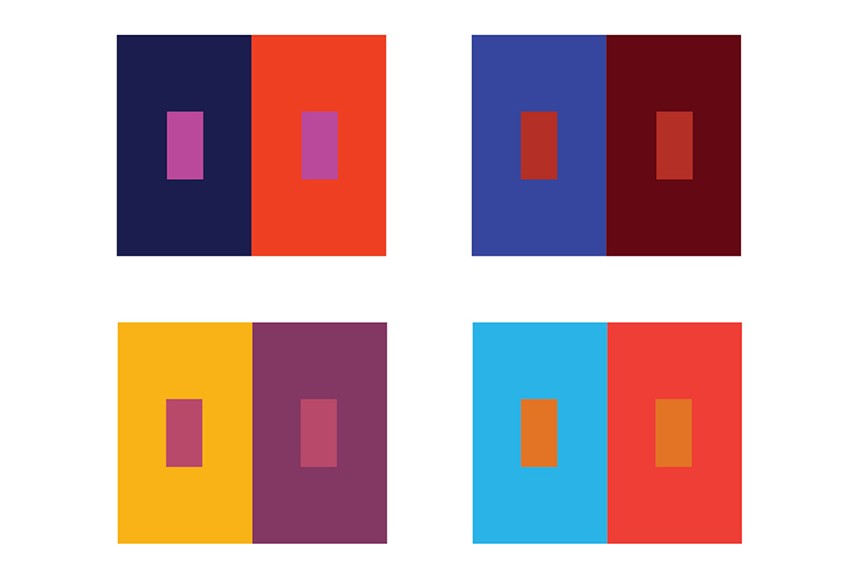
| What is simultaneous contrast? | Simultaneous contrast is a phenomenon where the perception of a color is affected by the colors surrounding it. A gray patch will appear lighter against a dark background and darker against a light background. |
| What role does texture play in creating contrast? | Textural contrast can add depth and interest to a piece. Juxtaposing smooth and rough textures creates a tactile and visual experience for the viewer. |
| How does line weight create contrast? | Varying the thickness (weight) of lines can create contrast. Thick lines can denote importance or presence, while thin lines can suggest subtlety or distance. |
| How can contrast affect the mood of artwork? | High contrast can create a sense of drama, energy, or excitement, while low contrast can convey calmness, subtlety, or melancholy. |
| What does “contrast of saturation” refer to? | The contrast of saturation is about juxtaposing highly saturated (vivid) colors with dull or muted colors. This makes the vibrant colors stand out more prominently. |
11. Mastering Contrast: Resources for Further Learning
To deepen your understanding of contrast, consider exploring the following resources:
- Books: Search for books on art principles, color theory, and composition.
- Online Courses: Platforms like Coursera and Skillshare offer courses on art and design fundamentals.
- Museums and Galleries: Visit museums and galleries to study how artists use contrast in their work.
- Online Communities: Join online art communities and forums to discuss and share ideas with other artists.
- WHAT.EDU.VN: Visit WHAT.EDU.VN for a wide range of answers and expert insights on art, design, and many other topics.
12. Conclusion: Embracing the Power of Contrast
Contrast is a fundamental principle that plays a vital role in art, design, and many other aspects of our lives. By understanding the different types of contrast and how to use them effectively, you can create more visually appealing, emotionally impactful, and conceptually rich works of art. Embrace the power of contrast and let it transform your creative endeavors.
Still have questions about contrast or any other topic? Don’t hesitate to ask the experts at WHAT.EDU.VN! We provide free answers to all your questions, connecting you with a community of knowledgeable individuals eager to share their expertise.
Ready to explore the world of knowledge?
Visit WHAT.EDU.VN today and ask your question!
Contact us:
- Address: 888 Question City Plaza, Seattle, WA 98101, United States
- WhatsApp: +1 (206) 555-7890
- Website: what.edu.vn
We’re here to help you find the answers you need!