What Colors Make Red? Understanding color mixing is key, and WHAT.EDU.VN offers a free resource to explore this fascinating topic. Mixing vibrant hues unlocks endless possibilities, and red is no exception. Explore color theory and discover the shades that create red.
1. Understanding the Color Wheel
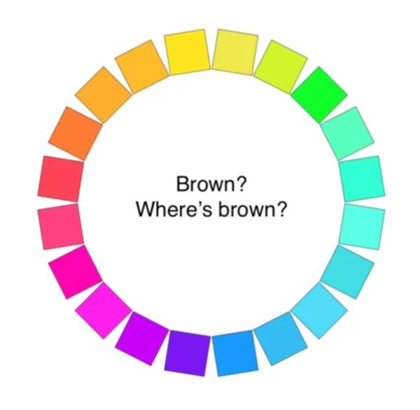
The color wheel is a visual representation of colors arranged according to their chromatic relationship. It’s a fundamental tool for artists, designers, and anyone interested in color mixing. Understanding the color wheel helps in predicting the outcomes of mixing different colors.
1.1. Primary Colors
Primary colors are the foundation of the color wheel. These colors cannot be created by mixing other colors together. The primary colors are:
- Red
- Yellow
- Blue
These colors are the building blocks for creating a wide range of other colors.
1.2. Secondary Colors
Secondary colors are created by mixing two primary colors together. The secondary colors are:
- Orange (Red + Yellow)
- Green (Blue + Yellow)
- Violet (Red + Blue)
These colors sit between the primary colors on the color wheel.
1.3. Tertiary Colors
Tertiary colors are created by mixing a primary color with a neighboring secondary color. These colors have two-word names, such as red-orange, blue-green, and yellow-violet. Examples of tertiary colors include:
- Red-Orange
- Yellow-Orange
- Yellow-Green
- Blue-Green
- Blue-Violet
- Red-Violet
Tertiary colors add complexity and nuance to the color palette.
1.4. Complementary Colors
Complementary colors are pairs of colors that sit opposite each other on the color wheel. When placed next to each other, they create a strong contrast. When mixed together, they neutralize each other, creating a gray or brown tone. Complementary color pairs include:
- Red and Green
- Yellow and Violet
- Blue and Orange
Understanding complementary colors is useful for creating visual harmony and depth in artwork.
2. Can You Actually Make Red?
While you can mix colors to achieve shades close to red, the truth is that you cannot create a pure red color by mixing other colors. Red is a primary color, meaning it’s a fundamental hue that stands on its own. Mixing other colors will only result in variations or shades of red, not true red itself.
Think of it like this: red is a basic ingredient. You can’t make flour by mixing other things; you need flour to start with. Similarly, you need a red pigment to achieve a red color.
3. Understanding Pigments and Light
The way we perceive color is affected by both light and pigments. It’s important to understand the difference between them to fully grasp why red cannot be mixed from other colors.
3.1. Additive Color Mixing (Light)
Additive color mixing involves combining different colored lights. In this system, the primary colors are red, green, and blue (RGB). When these three colors of light are mixed together in equal proportions, they create white light. This is how screens on computers, phones, and televisions produce color.
In additive mixing:
- Red + Green = Yellow
- Red + Blue = Magenta
- Green + Blue = Cyan
- Red + Green + Blue = White
3.2. Subtractive Color Mixing (Pigments)
Subtractive color mixing involves combining different colored pigments, such as paints or inks. In this system, the primary colors are cyan, magenta, and yellow (CMY), which are the complements of red, green, and blue. When these three colors of pigment are mixed together in equal proportions, they create black. This is how printers produce color on paper.
In subtractive mixing:
- Cyan + Magenta = Blue
- Cyan + Yellow = Green
- Magenta + Yellow = Red
- Cyan + Magenta + Yellow = Black
Since red is created by mixing magenta and yellow in the subtractive system, some may argue that red can be mixed. However, this “red” is still derived from existing magenta and yellow pigments, not created from scratch.
3.3. Why Pure Red Can’t Be Mixed
The reason why pure red cannot be mixed from other pigments comes down to the nature of those pigments. Every pigment absorbs certain wavelengths of light and reflects others. A “pure” red pigment reflects primarily red wavelengths while absorbing most others.
If you try to mix two colors to create red, you’re essentially trying to create a pigment that reflects only red light. However, the pigments you’re mixing will always absorb some red light, resulting in a less saturated, less pure red.
4. Achieving Red-Like Hues
While you can’t create true red, you can mix colors to get close. By understanding color theory and pigment properties, you can achieve a range of reddish hues that can be used in various applications.
4.1. Mixing Magenta and Yellow
As mentioned earlier, mixing magenta and yellow can produce a red-like color. However, the result will depend on the specific pigments used. Some magenta and yellow pigments may contain traces of other colors, which can affect the final hue.
- Considerations:
- Use high-quality magenta and yellow pigments.
- Experiment with different ratios to achieve the desired shade.
- Be aware that the resulting red will likely be less vibrant than a pure red pigment.
4.2. Adjusting Existing Reds
If you have a red paint that is not quite the shade you want, you can adjust it by adding small amounts of other colors. This is often a more effective way to achieve the desired red hue than trying to mix it from scratch.
- To warm up a red (make it more orange): Add a touch of yellow.
- To cool down a red (make it more violet): Add a touch of blue or violet.
- To deepen a red: Add a touch of black or brown.
- To lighten a red: Add white (be aware that white can also make the red appear more pink or pastel).
4.3. Understanding Undertones
Every color has an undertone, which is a subtle hint of another color that influences its overall appearance. Red can have warm (orange) or cool (blue) undertones. Understanding the undertone of your red paint is crucial for achieving the desired results when mixing.
- Warm Reds: These reds have an orange undertone and are often described as fiery or vibrant.
- Cool Reds: These reds have a blue undertone and are often described as deep or elegant.
To determine the undertone of a red paint, compare it to other reds or mix it with white. The undertone will become more apparent as the color is diluted.
5. The Role of Color Temperature
Color temperature refers to the warmth or coolness of a color. Warm colors, such as reds, oranges, and yellows, are associated with energy and excitement. Cool colors, such as blues, greens, and violets, are associated with calmness and serenity.
5.1. Warm Reds vs. Cool Reds
The color temperature of a red can greatly impact its overall effect. Warm reds tend to be more attention-grabbing, while cool reds can be more sophisticated and subtle.
- Warm Reds: These reds are often used to create a sense of passion, energy, or excitement. They are ideal for use in situations where a strong visual impact is desired.
- Cool Reds: These reds are often used to create a sense of elegance, sophistication, or mystery. They are ideal for use in situations where a more subtle effect is desired.
5.2. Adjusting Color Temperature
You can adjust the color temperature of a red by adding small amounts of other colors. To warm up a red, add a touch of yellow or orange. To cool down a red, add a touch of blue or violet.
- Example: If you have a cool red that you want to make warmer, add a small amount of yellow. Start with a tiny amount and gradually increase it until you achieve the desired color temperature.
6. Exploring Different Red Pigments
Different red pigments have different properties, including hue, saturation, and transparency. Understanding these properties can help you choose the right red pigment for your specific needs.
6.1. Cadmium Red
Cadmium red is a strong, opaque red with excellent lightfastness. It is a warm red with a slightly orange undertone. Cadmium red is ideal for use in situations where a bold, vibrant red is desired.
- Properties:
- Opaque
- Warm undertone
- Excellent lightfastness
6.2. Alizarin Crimson
Alizarin crimson is a transparent, cool red with a blue undertone. It is known for its rich, deep color and is often used for glazing. Alizarin crimson is less lightfast than cadmium red and may fade over time.
- Properties:
- Transparent
- Cool undertone
- Lower lightfastness
6.3. Quinacridone Red
Quinacridone red is a modern synthetic pigment that offers excellent lightfastness and transparency. It is available in a range of hues, from warm to cool. Quinacridone red is a versatile pigment that can be used for a variety of applications.
- Properties:
- Transparent
- Available in warm and cool undertones
- Excellent lightfastness
6.4. Vermilion
Vermilion is a historical red pigment that was originally made from the mineral cinnabar. It is a bright, opaque red with a slightly orange undertone. Modern vermilion is usually made from a synthetic pigment.
- Properties:
- Opaque
- Warm undertone
- Good lightfastness (depending on the specific pigment)
7. Red Color Variations
Red comes in many variations with different mixing formulations.
7.1. Scarlet
Scarlet is a bright red color, slightly orange. To create scarlet, mix red with a small amount of yellow. Adjust the proportion to match different scarlet tones.
7.2. Crimson
Crimson is a deep, slightly blue-toned red. To make crimson, mix red with a touch of blue or violet. Crimson is a rich, vibrant color used to add depth to paintings.
7.3. Maroon
Maroon is a dark red with brown undertones. To create maroon, mix red with brown or black. The resulting maroon is a deep, earthy color that can be used for shadows or to add richness to any composition.
7.4. Burgundy
Burgundy is a dark red, similar to maroon, with more purple tones. Mix red with purple to make burgundy. Burgundy works great for depth and shadows.
8. Color Mixing Techniques
Mastering color mixing techniques can help you achieve a wider range of colors and effects. Here are a few essential techniques to consider.
8.1. Glazing
Glazing involves applying thin, transparent layers of color over a base layer. This technique can be used to create depth, luminosity, and subtle color variations. Alizarin crimson is often used for glazing due to its transparency.
- How to Glaze:
- Apply a base layer of color.
- Allow the base layer to dry completely.
- Mix a transparent glaze color by diluting your paint with a glazing medium.
- Apply the glaze color in a thin, even layer.
- Allow the glaze layer to dry completely before applying additional layers.
8.2. Scumbling
Scumbling involves applying a broken, textured layer of color over a base layer. This technique can be used to create a sense of atmosphere, texture, or movement.
- How to Scumble:
- Apply a base layer of color.
- Allow the base layer to dry completely.
- Load a brush with a small amount of paint.
- Wipe off most of the paint onto a paper towel.
- Lightly drag the brush over the surface of the canvas, creating a broken, textured layer.
8.3. Blending
Blending involves smoothly transitioning between two or more colors. This technique can be used to create a sense of depth, form, or realism.
- How to Blend:
- Apply two or more colors next to each other on the canvas.
- Use a clean, soft brush to gently blend the colors together at the edges.
- Continue blending until the transition between the colors is smooth and seamless.
9. Tools and Materials for Color Mixing
Having the right tools and materials can make color mixing easier and more enjoyable. Here are a few essential items to consider.
9.1. Palette
A palette is a surface used for mixing paints. Palettes are available in a variety of materials, including wood, plastic, and glass. Choose a palette that is easy to clean and provides enough space for mixing colors.
9.2. Brushes
Brushes are used to apply paint to the canvas. Brushes are available in a variety of shapes, sizes, and materials. Choose brushes that are appropriate for the type of paint you are using and the effects you want to achieve.
9.3. Painting Mediums
Painting mediums are substances that are added to paint to modify its properties. Mediums can be used to change the consistency, drying time, transparency, or gloss of paint.
9.4. Color Wheel
A color wheel is a visual representation of the colors arranged according to their chromatic relationship. A color wheel can be a useful tool for understanding color theory and predicting the outcomes of mixing different colors.
10. Why This Matters: Applications of Color Theory
Color theory is more than just an academic exercise. Understanding color relationships is essential in many practical applications.
10.1. Painting and Fine Arts
For painters, understanding color theory is crucial for creating realistic and expressive artwork. Knowing how to mix colors, create harmonious color schemes, and evoke specific emotions through color is essential for success.
10.2. Graphic Design
In graphic design, color theory is used to create visually appealing and effective designs for websites, logos, and marketing materials. Choosing the right colors can help to attract attention, convey a message, and establish a brand identity.
10.3. Interior Design
Interior designers use color theory to create harmonious and inviting spaces. The colors used in a room can affect the mood, energy level, and perceived size of the space.
10.4. Fashion Design
Fashion designers use color theory to create stylish and flattering clothing. The colors used in a garment can affect the wearer’s appearance and convey a specific message.
10.5. Photography and Filmmaking
Photographers and filmmakers use color theory to create visually striking images and videos. The colors used in a scene can affect the mood, atmosphere, and overall impact of the work.
11. Common Color Mixing Mistakes
Even experienced artists can make mistakes when mixing colors. Here are a few common mistakes to avoid.
11.1. Overmixing
Overmixing can result in muddy, dull colors. Mix colors gently and only until they are just combined.
11.2. Using Too Many Colors
Using too many colors in a mix can also result in muddy colors. Start with a few basic colors and gradually add others as needed.
11.3. Not Considering Undertones
Failing to consider the undertones of your paints can lead to unexpected results. Always be aware of the undertones of your colors and how they will affect the final mix.
11.4. Not Keeping a Record
Not keeping a record of your color mixes can make it difficult to reproduce them later. Keep a notebook or chart to record the colors you used and the proportions in which they were mixed.
12. Where to Learn More
If you’re interested in learning more about color theory, there are many resources available.
12.1. Online Courses
Numerous online platforms offer courses on color theory, ranging from beginner to advanced levels. Some popular options include Coursera, Udemy, and Skillshare.
12.2. Books
Many excellent books on color theory are available. Some popular titles include “Color and Light” by James Gurney, “Interaction of Color” by Josef Albers, and “The Elements of Color” by Johannes Itten.
12.3. Workshops and Classes
Many art schools and community centers offer workshops and classes on color theory. These can be a great way to learn from experienced instructors and interact with other students.
12.4. Online Communities
Online communities, such as forums and social media groups, can be a valuable resource for learning about color theory and connecting with other artists.
13. Advanced Color Concepts
Once you have a solid understanding of the basics of color theory, you can move on to more advanced concepts.
13.1. Munsell Color System
The Munsell color system is a way of precisely specifying colors based on three dimensions: hue, value (lightness), and chroma (purity). It provides a standardized system for describing and organizing colors.
13.2. Color Harmony
Color harmony refers to the pleasing arrangement of colors in a composition. There are several established color harmonies, such as complementary, analogous, triadic, and tetradic.
13.3. Color Psychology
Color psychology is the study of how colors affect human emotions and behavior. Understanding color psychology can help you choose colors that evoke specific feelings or convey a particular message.
14. Color in Different Mediums
Color behaves differently depending on the medium you’re using.
14.1. Watercolor
Watercolor paints are transparent, allowing the white of the paper to shine through. This creates a luminous effect, but it also means that colors can be easily influenced by the underlying surface.
14.2. Oil Paint
Oil paints are opaque and can be layered to create rich, deep colors. Oil paints also allow for a longer working time than other mediums, making them ideal for blending and glazing.
14.3. Acrylic Paint
Acrylic paints are versatile and can be used in a variety of ways. They are fast-drying and can be thinned with water or used with mediums to create different effects.
14.4. Digital Painting
Digital painting involves creating artwork using computer software. Digital painting offers many advantages, such as the ability to easily undo mistakes, experiment with different colors, and create complex effects.
15. FAQs: What Colors Make Red?
15.1. Can I mix any two colors to get red?
No, red is a primary color and cannot be created by mixing other colors.
15.2. What colors can I mix to get close to red?
You can mix magenta and yellow to create a red-like color, but it will not be a pure red.
15.3. How can I make a red color warmer?
Add a touch of yellow or orange to the red.
15.4. How can I make a red color cooler?
Add a touch of blue or violet to the red.
15.5. What are the best red pigments to use?
Some popular red pigments include cadmium red, alizarin crimson, and quinacridone red.
15.6. What is glazing?
Glazing is a technique of applying thin, transparent layers of color over a base layer.
15.7. What is scumbling?
Scumbling is a technique of applying a broken, textured layer of color over a base layer.
15.8. How can I create a smooth transition between colors?
Use blending to create a smooth transition between colors.
15.9. What is a color wheel?
A color wheel is a visual representation of the colors arranged according to their chromatic relationship.
15.10. What are primary colors?
Primary colors are the foundation of the color wheel and cannot be created by mixing other colors. They are red, yellow, and blue.
16. The Importance of Experimentation
The best way to learn about color mixing is to experiment. Try mixing different colors together and see what happens. Keep a record of your mixes and note the proportions of each color you used. The more you experiment, the better you’ll understand the nuances of color and how to achieve the results you want.
16.1. Create a Color Chart
A color chart is a visual representation of the colors you can create by mixing different pigments. Create a color chart by mixing different combinations of colors and painting them onto a piece of paper or canvas. Label each color with the pigments you used and the proportions in which they were mixed.
16.2. Keep a Journal
Keep a journal of your color mixing experiments. Note the colors you used, the proportions in which they were mixed, and the results you achieved. Also, note any challenges you encountered and how you overcame them.
16.3. Seek Feedback
Share your color mixing experiments with other artists and ask for feedback. They may be able to offer insights or suggestions that you hadn’t considered.
17. Beyond Basic Mixing: Achieving Unique Effects
Color mixing goes beyond just creating the right hue. It’s about achieving specific effects and moods in your artwork.
17.1. Creating Depth
Depth can be achieved by understanding how colors recede or advance visually. Cool colors tend to recede, while warm colors tend to advance. By using this knowledge, you can create a sense of depth in your paintings.
17.2. Creating Mood
Colors can evoke different emotions and moods. Warm colors tend to create a sense of energy and excitement, while cool colors tend to create a sense of calmness and serenity. By carefully choosing the colors you use, you can create a specific mood in your artwork.
17.3. Creating Contrast
Contrast can be created by using colors that are opposite each other on the color wheel. Complementary colors, such as red and green, create a strong contrast when placed next to each other.
18. Resources from WHAT.EDU.VN
For more in-depth information and free resources on color theory and mixing, visit WHAT.EDU.VN.
18.1. Free Guides and Tutorials
WHAT.EDU.VN offers a variety of free guides and tutorials on color theory and mixing. These resources cover a wide range of topics, from basic color mixing to advanced techniques.
18.2. Community Forum
WHAT.EDU.VN hosts a community forum where you can connect with other artists, ask questions, and share your work. The forum is a great place to get feedback and learn from others.
18.3. Expert Advice
WHAT.EDU.VN provides access to expert advice on color theory and mixing. You can ask questions and receive personalized guidance from experienced artists.
19. Maximizing Your Color Mixing Knowledge
Continue to hone your color mixing expertise, refining your approach and skills.
19.1. Continuous Learning
Stay updated with color theory trends and studies. Color theory is continuously evolving, and new findings can refine your knowledge and practices.
19.2. Practice and Patience
Practice regularly to master color mixing. Like any skill, proficiency in color mixing requires consistent practice. The more you experiment, the better you’ll get at predicting and achieving the colors you desire.
19.3. Seek Feedback
Continuously seek feedback from peers and mentors. Constructive criticism can help you identify areas for improvement and expand your artistic horizons.
20. Need More Answers? Ask WHAT.EDU.VN
Still have questions about color mixing or other topics? At WHAT.EDU.VN, we understand the challenges of finding quick, reliable answers. That’s why we offer a free platform where you can ask any question and receive expert responses. Whether you’re a student, professional, or simply curious, our goal is to provide you with the knowledge you need, when you need it.
Don’t waste time searching endlessly online or wondering where to turn for advice. Visit WHAT.EDU.VN today and experience the convenience of having a community of knowledgeable individuals at your fingertips. Ask your question now and get the answer you’re looking for, completely free.
Contact Us:
Address: 888 Question City Plaza, Seattle, WA 98101, United States
WhatsApp: +1 (206) 555-7890
Website: WHAT.EDU.VN
Let what.edu.vn be your go-to resource for all your questions. We’re here to help you learn, grow, and succeed.