Pareto charts are powerful tools for identifying and prioritizing the most significant factors in a dataset, and WHAT.EDU.VN offers comprehensive explanations and resources to help you understand and utilize them effectively. By visualizing data in a way that highlights the most impactful elements, Pareto analysis allows for focused problem-solving and resource allocation. Improve your data analysis skills by learning about defect analysis, the Pareto principle, and statistical quality control.
1. What Is a Pareto Chart?
A Pareto chart is a type of chart that contains both bars and a line graph, where individual values are represented in descending order by bars, and the cumulative total is represented by the line. Pareto charts are invaluable tools for pinpointing the most critical issues or factors within a set of data. According to Juran’s Pareto Principle, these charts visually display the 80/20 rule, suggesting that approximately 80% of effects come from 20% of the causes. This principle allows businesses to focus on the most significant factors that drive results.
Pareto charts are particularly useful in quality control and defect analysis. By presenting data in a descending order of importance, these charts make it easy to identify and prioritize the factors that have the most significant impact.
1.1. Key Components of a Pareto Chart
A Pareto chart combines elements of both bar graphs and line graphs to provide a comprehensive view of data. Understanding these components is essential for interpreting and utilizing Pareto charts effectively.
Here are the primary components of a Pareto chart:
-
Bars: Each bar represents a category or factor, such as a type of defect, a cause of a problem, or a customer complaint. The height of the bar corresponds to the frequency or impact of that category.
-
Descending Order: The bars are arranged in descending order from left to right, with the tallest bar representing the most significant factor and the shortest bar representing the least significant factor.
-
Line Graph: A cumulative frequency line runs across the top of the chart, illustrating the cumulative percentage of the categories. This line helps to identify the point at which the most significant factors account for a large portion of the total impact.
-
X-Axis: The horizontal axis displays the categories or factors being analyzed.
-
Y-Axis: The vertical axis on the left side represents the frequency or impact of each category. The vertical axis on the right side represents the cumulative percentage.
-
Title: A descriptive title that accurately reflects the purpose and scope of the chart.
-
Labels: Clear labels for each bar and axis to ensure that the chart is easily understandable.
By combining these elements, a Pareto chart provides a clear and concise visual representation of the relative importance of different factors, enabling informed decision-making and prioritization.
1.2. How Does a Pareto Chart Work?
Pareto charts function by visually prioritizing data, highlighting the most significant factors within a dataset. Here’s a step-by-step breakdown of how they work:
- Data Collection: Gather data related to the factors you want to analyze. This data could include the frequency of defects, the cost of problems, the number of complaints, or any other relevant metric.
- Categorization: Organize the data into categories. Each category should represent a specific factor that you want to evaluate.
- Calculation: Calculate the frequency or impact of each category. This could be the number of occurrences, the total cost, or any other relevant measure.
- Sorting: Sort the categories in descending order based on their frequency or impact. The category with the highest value should be listed first, followed by the category with the next highest value, and so on.
- Cumulative Percentage Calculation: Calculate the cumulative percentage for each category. This is the percentage of the total that is accounted for by that category and all preceding categories.
- Chart Creation: Create a bar graph with the categories on the x-axis and the frequency or impact on the y-axis. Arrange the bars in descending order.
- Line Graph Overlay: Add a line graph that plots the cumulative percentage on the right y-axis. The line should start at the top of the first bar and continue to the top of each subsequent bar.
- Analysis: Analyze the chart to identify the most significant factors. These are the factors represented by the tallest bars and the steepest portion of the cumulative percentage line.
- Action: Take action to address the most significant factors. This could involve implementing process improvements, allocating resources, or making other changes to reduce the impact of these factors.
By following these steps, you can use a Pareto chart to quickly identify the most important factors in your data and focus your efforts on addressing them. This approach helps to maximize the impact of your actions and achieve the greatest overall improvement.
Alt: Pareto chart example showcasing defect frequencies and cumulative impact, used for quality management and defect analysis.
1.3. Pareto Chart Example Table
To illustrate how a Pareto chart works, consider a manufacturing company that wants to analyze the types of defects occurring in their production process. The following table shows the data collected:
| Type of Defect | Frequency of Defect | % of Total | Cumulative % |
|---|---|---|---|
| Button Defect | 23 | 39.0 | 39.0 |
| Pocket Defect | 16 | 27.1 | 66.1 |
| Collar Defect | 10 | 16.9 | 83.1 |
| Cuff Defect | 7 | 11.9 | 95.0 |
| Sleeve Defect | 3 | 5.1 | 100.1 |
| Total | 59 | – | – |
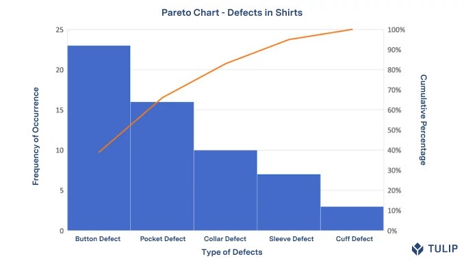

Here’s how the cumulative percentages are calculated:
- Button Defect: 39.0%
- Pocket Defect: 39.0% + 27.1% = 66.1%
- Collar Defect: 39.0% + 27.1% + 16.9% = 83.1%
- Cuff Defect: 39.0% + 27.1% + 16.9% + 11.9% = 95.0%
- Sleeve Defect: 39.0% + 27.1% + 16.9% + 11.9% + 5.1% = 100.1%
This table shows that by addressing the button and pocket defects, the company can eliminate 66.1% of all defects. The Pareto chart, constructed from this data, would visually emphasize these two defect types, making it clear where the company should focus its efforts.
2. What Is The Pareto Principle?
The Pareto Principle, also known as the 80/20 rule, posits that approximately 80% of effects come from 20% of the causes. This principle is a cornerstone of Pareto analysis and has broad applications across various fields. In business, it suggests that a small fraction of inputs often drives the majority of outputs. In quality management, it implies that a few critical defects account for most of the problems.
The Pareto Principle is not an exact mathematical relationship but rather a general observation that highlights the disproportionate impact of certain factors. Understanding and applying this principle allows organizations to focus on the areas that will yield the most significant improvements.
2.1. Applying the Pareto Principle to Quality Management
In quality management, the Pareto Principle is used to identify and prioritize the most significant sources of defects or issues. By focusing on the 20% of causes that contribute to 80% of the problems, organizations can efficiently allocate resources and implement targeted solutions.
For example, if a manufacturing company identifies several types of defects, a Pareto chart can help determine which defects are most frequent and impactful. By addressing these key defects, the company can achieve the greatest overall improvement in product quality.
The Pareto Principle is also valuable in continuous improvement initiatives. By regularly analyzing data and identifying the most significant factors, organizations can continuously refine their processes and improve their performance.
2.2. Benefits of Using the Pareto Principle
Using the Pareto Principle offers several significant benefits:
- Prioritization: It helps focus efforts on the most critical issues, ensuring resources are used efficiently.
- Efficiency: By addressing the most impactful causes, organizations can achieve the greatest improvements with minimal effort.
- Problem Solving: It simplifies problem-solving by narrowing down the areas that need attention.
- Decision Making: It supports informed decision-making by providing a clear understanding of the relative importance of different factors.
- Resource Allocation: It guides the allocation of resources by highlighting where investments will have the greatest impact.
- Continuous Improvement: It supports continuous improvement by providing a framework for ongoing analysis and refinement of processes.
By leveraging the Pareto Principle, organizations can drive significant improvements in quality, efficiency, and overall performance.
2.3. Limitations of the Pareto Principle
While the Pareto Principle is a valuable tool, it has limitations:
- Oversimplification: The 80/20 rule is a general observation and may not perfectly apply to all situations. Relying too heavily on this ratio can lead to oversimplification of complex problems.
- Static Analysis: Pareto analysis is often a snapshot in time. The factors that are most significant can change, so regular analysis is necessary to maintain relevance.
- Ignores Interdependencies: It focuses on individual factors and may not account for interdependencies between them. Addressing one factor may impact others, which is not always captured in the analysis.
- Data Dependency: The accuracy of Pareto analysis depends on the quality of the data. Incomplete or inaccurate data can lead to misleading results.
- Focus on Symptoms: It identifies the most frequent problems but may not address the underlying root causes. Root cause analysis is often needed in conjunction with Pareto analysis.
- Potential for Neglect: Focusing solely on the most significant factors can lead to neglect of less frequent but still important issues.
Despite these limitations, the Pareto Principle remains a powerful tool for prioritization and problem-solving when used thoughtfully and in conjunction with other analytical methods.
3. How to Create a Pareto Chart
Creating a Pareto chart involves several steps, from data collection to visual representation. Here’s a detailed guide to help you create an effective Pareto chart:
3.1. Step-by-Step Guide
- Identify the Problem: Clearly define the problem or issue you want to analyze. This could be anything from defects in a manufacturing process to customer complaints.
- Collect Data: Gather data related to the problem. Be sure to collect enough data to provide a representative sample.
- Categorize Data: Organize the data into categories. Each category should represent a specific factor or cause of the problem.
- Calculate Frequency: Calculate the frequency or count for each category. This is the number of times each factor occurs within the data set.
- Calculate Percentage: Calculate the percentage of the total for each category. This is the frequency of the category divided by the total frequency, multiplied by 100.
- Calculate Cumulative Percentage: Calculate the cumulative percentage for each category. This is the sum of the percentages for the category and all preceding categories.
- Sort Data: Sort the categories in descending order based on their frequency or percentage.
- Create Bar Chart: Create a bar chart with the categories on the x-axis and the frequency on the y-axis. Arrange the bars in descending order.
- Add Cumulative Line: Add a line graph that plots the cumulative percentage on the right y-axis. The line should start at the top of the first bar and continue to the top of each subsequent bar.
- Label Chart: Add labels to the chart, including a title, axis labels, and category labels.
- Analyze Chart: Analyze the chart to identify the most significant factors. These are the factors represented by the tallest bars and the steepest portion of the cumulative percentage line.
- Take Action: Develop and implement solutions to address the most significant factors.
3.2. Tools for Creating Pareto Charts
Several tools are available for creating Pareto charts, ranging from simple spreadsheet programs to specialized statistical software.
- Microsoft Excel: Excel is a widely used tool for creating basic Pareto charts. It provides the necessary functionality for data entry, calculation, and chart creation.
- Google Sheets: Similar to Excel, Google Sheets is a free, web-based spreadsheet program that can be used to create Pareto charts.
- Minitab: Minitab is a statistical software package that offers advanced features for creating and analyzing Pareto charts. It is often used in professional settings for quality control and process improvement.
- JMP: JMP is another statistical software package that provides comprehensive tools for data analysis and visualization, including Pareto charts.
- Online Pareto Chart Generators: Several online tools allow you to create Pareto charts quickly and easily. These tools often provide templates and automated calculations to simplify the process.
3.3. Example: Creating a Pareto Chart in Excel
Here’s an example of how to create a Pareto chart in Excel:
- Enter Data: Open Excel and enter your data into a spreadsheet. Include columns for the category, frequency, percentage, and cumulative percentage.
- Calculate Percentage: In the percentage column, enter the formula to calculate the percentage for each category. For example, if the frequency is in column B and the total frequency is in cell B7, the formula would be
=B2/$B$7*100. - Calculate Cumulative Percentage: In the cumulative percentage column, enter the formula to calculate the cumulative percentage for each category. For example, the formula for the first category would be
=C2, and the formula for the second category would be=C2+C3, and so on. - Sort Data: Select the data range and sort it in descending order based on the frequency or percentage column.
- Create Chart: Select the category and frequency columns, then go to the “Insert” tab and choose a column chart.
- Add Cumulative Line: Add a secondary y-axis and plot the cumulative percentage data as a line graph.
- Customize Chart: Customize the chart by adding labels, titles, and formatting the axes.
By following these steps, you can create a Pareto chart in Excel that visually represents your data and highlights the most significant factors.
4. Real-World Applications of Pareto Charts
Pareto charts are used in a variety of industries to identify and prioritize the most significant factors contributing to a problem or issue. Here are some real-world applications of Pareto charts:
4.1. Manufacturing
In manufacturing, Pareto charts are used to identify the most common types of defects in a production process. By focusing on the defects that occur most frequently, manufacturers can improve product quality, reduce waste, and increase efficiency.
For example, a company that produces electronic devices might use a Pareto chart to analyze the types of defects found during quality control inspections. The chart could reveal that a high percentage of defects are due to faulty soldering. By addressing this issue, the company can significantly reduce the overall defect rate.
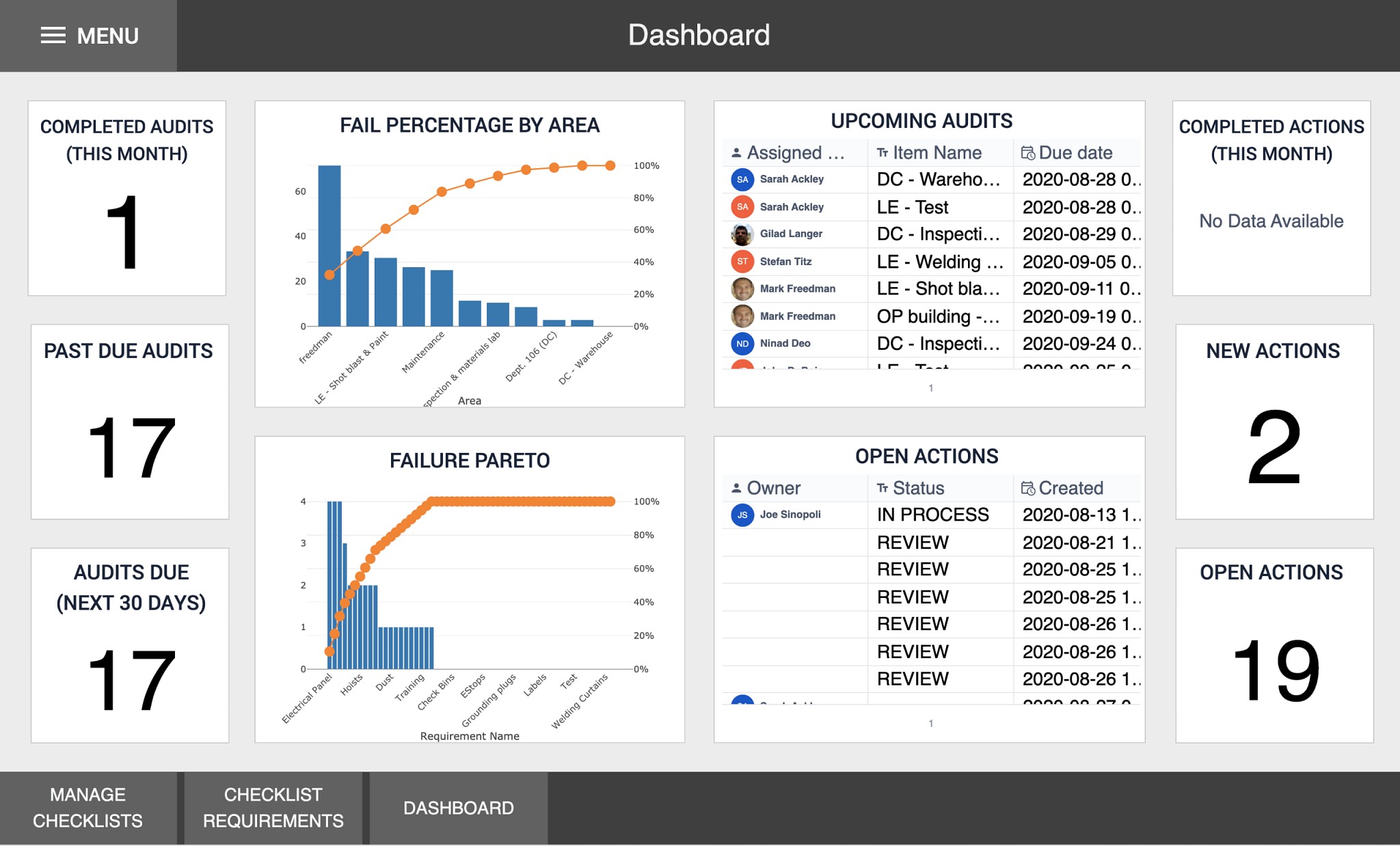
Alt: Quality event dashboard screenshot, showcasing real-time tracking and analysis of quality issues in manufacturing using Tulip analytics.
4.2. Healthcare
In healthcare, Pareto charts are used to analyze various factors, such as patient complaints, medical errors, and readmission rates. By identifying the most common issues, healthcare providers can improve patient care, reduce costs, and enhance overall performance.
For example, a hospital might use a Pareto chart to analyze patient complaints. The chart could reveal that a large percentage of complaints are related to long wait times. By addressing this issue, the hospital can improve patient satisfaction and reduce negative feedback.
4.3. Customer Service
In customer service, Pareto charts are used to analyze customer complaints, identify common issues, and prioritize areas for improvement. By addressing the issues that generate the most complaints, companies can improve customer satisfaction, reduce churn, and enhance their reputation.
For example, a telecommunications company might use a Pareto chart to analyze customer complaints. The chart could reveal that a high percentage of complaints are related to billing errors. By addressing this issue, the company can reduce customer frustration and improve customer retention.
4.4. Project Management
In project management, Pareto charts are used to identify the most significant risks, prioritize tasks, and allocate resources effectively. By focusing on the factors that have the greatest impact on project success, project managers can increase the likelihood of delivering projects on time and within budget.
For example, a construction company might use a Pareto chart to analyze the factors that contribute to project delays. The chart could reveal that a high percentage of delays are due to weather conditions. By factoring this into their planning, the company can better manage its projects and reduce the risk of delays.
4.5. Software Development
In software development, Pareto charts are used to identify the most common types of bugs, prioritize features, and allocate development resources effectively. By focusing on the bugs that have the greatest impact on users, software developers can improve the quality and reliability of their products.
For example, a software company might use a Pareto chart to analyze bug reports. The chart could reveal that a high percentage of bugs are related to a specific module. By addressing this issue, the company can improve the stability of its software and reduce the number of user complaints.
5. Benefits of Using Pareto Charts
Using Pareto charts offers numerous benefits across various industries and applications. Here are some of the key advantages:
5.1. Improved Decision Making
Pareto charts provide a clear and concise visual representation of data, making it easier to identify the most significant factors and make informed decisions. By focusing on the factors that have the greatest impact, decision-makers can allocate resources effectively and achieve the best possible outcomes.
For example, a marketing manager might use a Pareto chart to analyze the effectiveness of different marketing campaigns. The chart could reveal that a small number of campaigns generate the majority of leads. By focusing on these high-performing campaigns, the manager can optimize their marketing efforts and increase lead generation.
5.2. Enhanced Problem Solving
Pareto charts help to narrow down the scope of problems and identify the root causes. By focusing on the factors that contribute most significantly to the problem, problem-solving teams can develop targeted solutions and achieve lasting improvements.
For example, a supply chain manager might use a Pareto chart to analyze the causes of shipping delays. The chart could reveal that a small number of suppliers account for the majority of delays. By working with these suppliers to improve their performance, the manager can reduce shipping delays and improve supply chain efficiency.
5.3. Increased Efficiency
Pareto charts enable organizations to allocate resources more efficiently by focusing on the areas that will yield the greatest returns. By addressing the most significant factors, organizations can achieve maximum impact with minimal effort.
For example, a human resources manager might use a Pareto chart to analyze employee turnover. The chart could reveal that a small number of factors, such as lack of career development opportunities, contribute to the majority of turnover. By addressing these issues, the manager can reduce turnover and improve employee retention.
5.4. Better Prioritization
Pareto charts help to prioritize tasks and initiatives by highlighting the most important factors. By focusing on the tasks and initiatives that have the greatest impact, organizations can ensure that they are working on the right things and achieving their goals.
For example, an IT manager might use a Pareto chart to prioritize IT projects. The chart could reveal that a small number of projects will deliver the majority of business value. By focusing on these high-impact projects, the manager can maximize the return on investment for IT spending.
5.5. Clear Communication
Pareto charts provide a simple and effective way to communicate complex data to a wide audience. By presenting data in a visual format, Pareto charts make it easier for people to understand the key issues and make informed decisions.
For example, a project team might use a Pareto chart to communicate the status of a project to stakeholders. The chart could reveal that a small number of tasks are critical to the project’s success. By highlighting these critical tasks, the team can ensure that stakeholders are aware of the key priorities and can provide support where needed.
Alt: Screenshot of Tulip Analytics displaying real-time Pareto charts and operations data, facilitating root cause analysis and quality management in manufacturing.
6. Tips for Effective Pareto Chart Analysis
To maximize the benefits of using Pareto charts, here are some tips for effective analysis:
6.1. Ensure Data Accuracy
The accuracy of a Pareto chart depends on the quality of the data. Make sure that the data is accurate, complete, and representative of the problem you are analyzing.
6.2. Define Categories Clearly
Clearly define the categories you are using in the chart. Each category should be distinct and mutually exclusive.
6.3. Use Appropriate Metrics
Choose metrics that are relevant to the problem you are analyzing. The metrics should be measurable and quantifiable.
6.4. Focus on the “Vital Few”
Focus on the factors that contribute most significantly to the problem. These are the “vital few” that should be addressed first.
6.5. Combine with Other Tools
Use Pareto charts in conjunction with other problem-solving tools, such as root cause analysis, to gain a deeper understanding of the issues.
6.6. Regularly Update Charts
Regularly update the charts to reflect changes in the data. This will ensure that the charts remain relevant and useful.
6.7. Involve Stakeholders
Involve stakeholders in the analysis process. This will ensure that the charts are used effectively and that the solutions are implemented successfully.
7. Common Mistakes to Avoid When Using Pareto Charts
To ensure that you are using Pareto charts effectively, here are some common mistakes to avoid:
7.1. Using Inaccurate Data
Using inaccurate data can lead to misleading results. Always double-check the data to ensure that it is accurate and complete.
7.2. Defining Categories Too Broadly
Defining categories too broadly can obscure important details. Make sure that the categories are specific enough to provide meaningful insights.
7.3. Ignoring the “Trivial Many”
Focusing solely on the “vital few” can lead to neglect of the “trivial many.” While the “vital few” are the most important, the “trivial many” can still contribute to the problem.
7.4. Failing to Take Action
Creating a Pareto chart is only the first step. It is important to take action based on the results of the analysis.
7.5. Over-Reliance on the 80/20 Rule
While the 80/20 rule is a useful guideline, it is not a hard-and-fast rule. Do not rely too heavily on this rule, as it may not apply perfectly to all situations.
7.6. Not Updating the Chart Regularly
Failing to update the chart regularly can lead to outdated information. Make sure to update the chart as new data becomes available.
7.7. Not Involving Stakeholders
Not involving stakeholders can lead to a lack of buy-in. Make sure to involve stakeholders in the analysis process to ensure that the solutions are implemented successfully.
8. Advanced Pareto Chart Techniques
For more in-depth analysis, consider these advanced techniques:
8.1. Weighted Pareto Charts
In some cases, the impact of different factors may vary. Weighted Pareto charts assign weights to each factor based on its impact, providing a more accurate representation of the overall problem.
For example, a customer service manager might use a weighted Pareto chart to analyze customer complaints, assigning higher weights to complaints that have a greater impact on customer satisfaction.
8.2. Stratified Pareto Charts
Stratified Pareto charts divide the data into subgroups to identify patterns and trends within different segments. This can help to uncover hidden issues that might not be apparent in a standard Pareto chart.
For example, a manufacturing company might use a stratified Pareto chart to analyze defects in different production lines, identifying variations in defect rates across the lines.
8.3. Pareto Charts with Cost Analysis
Incorporating cost analysis into Pareto charts can provide valuable insights into the financial impact of different factors. This can help to prioritize solutions based on their potential return on investment.
For example, a healthcare provider might use a Pareto chart with cost analysis to analyze medical errors, identifying the errors that result in the highest costs and prioritizing efforts to reduce those errors.
9. The Future of Pareto Charts
As technology continues to advance, Pareto charts are evolving to become more sophisticated and integrated with other data analysis tools. Some of the future trends in Pareto charts include:
9.1. Real-Time Pareto Analysis
Real-time Pareto analysis allows organizations to monitor data continuously and identify emerging issues as they occur. This enables proactive problem-solving and faster response times.
For example, a supply chain manager might use real-time Pareto analysis to monitor shipping delays, identifying emerging bottlenecks and taking action to mitigate their impact.
9.2. Integration with Big Data Analytics
Integrating Pareto charts with big data analytics enables organizations to analyze large and complex datasets, uncovering hidden patterns and insights that would not be apparent using traditional methods.
For example, a marketing manager might use big data analytics to analyze customer behavior, identifying the factors that drive customer loyalty and tailoring marketing campaigns accordingly.
9.3. Artificial Intelligence and Machine Learning
Artificial intelligence (AI) and machine learning (ML) are being used to automate the creation and analysis of Pareto charts, making it easier for organizations to identify and prioritize the most significant factors.
For example, a software company might use AI to analyze bug reports, automatically generating Pareto charts that highlight the most common types of bugs and recommending solutions.
10. Frequently Asked Questions (FAQs) About Pareto Charts
Here are some frequently asked questions about Pareto charts:
| Question | Answer |
|---|---|
| What is the Pareto Principle? | The Pareto Principle, also known as the 80/20 rule, states that approximately 80% of effects come from 20% of the causes. |
| How do I create a Pareto chart? | To create a Pareto chart, collect data, categorize it, calculate frequencies and percentages, sort the data, and create a bar chart with a cumulative line. |
| What are the benefits of using Pareto charts? | Pareto charts improve decision-making, enhance problem-solving, increase efficiency, improve prioritization, and facilitate clear communication. |
| What are some common mistakes to avoid when using Pareto charts? | Common mistakes include using inaccurate data, defining categories too broadly, ignoring the “trivial many,” failing to take action, over-reliance on the 80/20 rule, not updating the chart regularly, and not involving stakeholders. |
| How can Pareto charts be used in manufacturing? | In manufacturing, Pareto charts can be used to identify the most common types of defects, prioritize process improvements, and allocate resources effectively. |
| What is a weighted Pareto chart? | A weighted Pareto chart assigns weights to each factor based on its impact, providing a more accurate representation of the overall problem. |
| What is a stratified Pareto chart? | A stratified Pareto chart divides the data into subgroups to identify patterns and trends within different segments. |
| How are AI and ML being used with Pareto charts? | AI and ML are being used to automate the creation and analysis of Pareto charts, making it easier for organizations to identify and prioritize the most significant factors. |
| Where can I find more information about Pareto charts? | You can find more information about Pareto charts on websites like WHAT.EDU.VN, which provide comprehensive explanations, tutorials, and examples. |
| Can Pareto charts be used in project management? | Yes, Pareto charts can be used in project management to identify the most significant risks, prioritize tasks, and allocate resources effectively. |
By understanding and applying Pareto charts effectively, organizations can drive significant improvements in quality, efficiency, and overall performance.
Conclusion
Pareto charts are invaluable tools for data analysis and decision-making, helping to identify and prioritize the most significant factors in any situation. By understanding the principles behind Pareto charts and following best practices for their creation and analysis, you can leverage their power to drive meaningful improvements in your organization.
Remember, the key to successful Pareto analysis is to focus on the “vital few” factors that have the greatest impact and to take action based on the insights you gain. With Pareto charts, you can transform data into actionable intelligence and achieve remarkable results.
Do you have questions or need more insights on how to apply Pareto charts to your specific needs? Visit WHAT.EDU.VN to ask your questions and receive free, expert advice. Our community is ready to help you uncover the most critical factors in your data and guide you toward effective solutions. Contact us at 888 Question City Plaza, Seattle, WA 98101, United States, or via WhatsApp at +1 (206) 555-7890. Start optimizing your decision-making today with what.edu.vn!
Alt: Illustration promoting ease and efficiency in daily tasks, encouraging users to explore how quality management solutions can enhance their work processes.